

Choosing the right colors can completely transform a space, outfit, artwork, or design project. Yet for beginners, color pairing often feels confusing and overwhelming. With so many shades, tones, and combinations available, it’s easy to worry about making the wrong choice. The good news? You don’t need to be a professional designer to create beautiful color combinations. Once you understand a few basic principles, pairing colors becomes simple, fun, and even intuitive.
In this beginner-friendly guide, you’ll learn practical color pairing tips that help you confidently combine shades, create harmony, and design spaces or visuals that feel balanced and stylish.
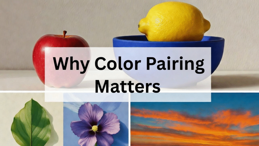
Why Color Pairing Matters
Color is more than decoration it shapes mood, perception, and emotional response. The right combination can make a room feel cozy, energetic, elegant, or calming.
For example:
- Warm tones create comfort and intimacy.
- Cool tones promote relaxation and freshness.
- Balanced contrasts add visual interest without chaos.
If you’ve ever walked into a beautifully styled home and instantly felt comfortable, chances are thoughtful color pairing played a big role. Many cozy interiors achieve this effect through carefully selected palettes, similar to ideas shared in this guide on creating a warm and inviting atmosphere:
https://homedecore.live/turned-warm-inviting/
Understanding color pairing helps you avoid mismatched designs and instead create intentional, pleasing visuals.
Understanding the Color Wheel (Your Best Beginner Tool)
Before diving into combinations, you need to know the foundation: the color wheel.
The color wheel organizes colors into three categories:
1. Primary Colors
- Red
- Blue
- Yellow
These cannot be created by mixing other colors.
2. Secondary Colors
- Orange
- Green
- Purple
Created by mixing primary colors.
3. Tertiary Colors
These are blends of primary and secondary colors, such as blue-green or red-orange.
The color wheel helps beginners quickly identify which colors naturally work well together.
Easy Color Pairing Methods for Beginners
You don’t need complex design knowledge start with these beginner-safe color pairing techniques.
1. Complementary Colors (High Contrast Pairing)
Complementary colors sit opposite each other on the color wheel.
Examples:
- Blue + Orange
- Red + Green
- Yellow + Purple
This pairing creates strong contrast and visual excitement. It works great for accents, statement décor, or bold designs.
Tip: Use one color as dominant and the other as an accent to avoid overwhelming the space.
2. Analogous Colors (Safe & Harmonious)
Analogous colors sit next to each other on the color wheel.
Examples:
- Blue, blue-green, green
- Yellow, yellow-orange, orange
These combinations feel natural and calming because they share similar undertones. Beginners often find this method easiest because it rarely clashes.
Analogous palettes are perfect when designing relaxing spaces like reading areas or cozy corners. You can see how harmonious tones enhance comfort in this cozy décor inspiration:
https://homedecore.live/cozy-corner/
3. Monochromatic Color Schemes
A monochromatic palette uses one color in multiple shades and tones.
Example:
- Light blue
- Sky blue
- Navy blue
This approach creates a sophisticated and cohesive look while staying beginner-friendly.
It works especially well in minimalist or small-space designs, where simplicity makes rooms feel larger and more organized. For inspiration on maximizing style in limited areas, explore:
https://homedecore.live/small-space-on-a-budget/
The 60-30-10 Rule (A Beginner Secret Weapon)
One of the easiest professional tricks is the 60-30-10 rule.
- 60% – Dominant color (walls, large furniture)
- 30% – Secondary color (curtains, rugs, bedding)
- 10% – Accent color (decor pieces, artwork)
This rule ensures balance and prevents color overload.
For example:
- 60% warm beige
- 30% soft brown
- 10% deep green accents
This balanced layering is commonly used in warm interior styling concepts like those discussed here:
https://homedecore.live/warm-interiors/
Warm vs Cool Colors: Know the Mood
Understanding temperature helps beginners pair colors intentionally.
Warm Colors
- Red
- Orange
- Yellow
- Terracotta
Create energy, comfort, and warmth.
Cool Colors
- Blue
- Green
- Purple
Create calmness and spaciousness.
A smart beginner approach is mixing one warm tone with one cool tone to balance emotion and visual comfort.
Neutral Colors: The Ultimate Color Pairing Helpers
Neutrals make color pairing easier and safer.
Common neutrals include:
- White
- Beige
- Gray
- Black
- Cream
They act as visual “resting spaces” that allow brighter colors to shine without overwhelming the design.
For example:
- Sage green + cream
- Dusty pink + white
- Navy blue + gray
Neutral bases are widely used in modern room decoration ideas because they keep designs timeless and adaptable. You can explore more styling inspiration here:
https://homedecore.live/room-decoration/
Start with Inspiration, Not Random Colors
Beginners often choose colors randomly this leads to mismatches.
Instead, start with inspiration such as:
- Artwork
- Fabric patterns
- Nature photos
- Printable designs
Even black-and-white visuals can guide strong contrast-based palettes. Minimalist printable themes often demonstrate excellent balance between tones and negative space, like those shown here:
https://homedecore.live/printables-black-and-white/
Pick one inspiration piece and extract 2–4 colors from it.
Using Accent Colors the Right Way
Accent colors bring personality into your design.
Good accent examples:
- Throw pillows
- Lamps
- Frames
- Decorative objects
- Wall art
Beginners should avoid using too many accent colors. One or two strong accents are enough to create visual interest.
For instance, adding blue accents to neutral backgrounds works beautifully — similar to concepts explored in creative background styling ideas:
https://homedecore.live/background-ideas/
Common Color Pairing Mistakes Beginners Make
Avoid these frequent errors:
1. Using Too Many Colors
Stick to 2–4 colors maximum.
2. Ignoring Lighting
Natural and artificial lighting change how colors appear.
3. Matching Everything Exactly
Perfect matching feels flat. Slight variation creates depth.
4. Forgetting Texture
Color looks different on wood, fabric, metal, or matte surfaces.
How to Test Color Pairings Before Committing
Before painting walls or buying décor:
- Test paint swatches on walls.
- View colors at different times of day.
- Create a small mood board.
- Use digital previews or printable samples.
Testing helps you avoid costly mistakes and builds confidence as a beginner.
Color Pairing for Different Spaces
Living Rooms
Use warm neutrals with one bold accent for welcoming energy.
Bedrooms
Soft analogous palettes promote relaxation.
Workspaces
Balanced cool tones increase focus. For productivity-friendly styling ideas, check:
https://homedecore.live/office-decoration/
Creative Spaces
Experiment with complementary contrasts to inspire creativity.
Seasonal Color Pairing Ideas
Beginners can also follow seasonal palettes:
- Spring: Soft greens, blush pink, cream
- Summer: Blue, white, sandy beige
- Autumn: Rust, mustard, brown
- Winter: Deep green, navy, metallic accents
Seasonal palettes naturally feel balanced because they mirror nature.
Confidence Tips for Beginners
Learning color pairing is a skill not a talent you’re born with. Keep these tips in mind:
- Start simple.
- Save palettes you love.
- Observe real interiors and fashion.
- Practice with small décor pieces first.
- Trust gradual experimentation.
Even professional designers refine their color sense over time.
Final Thoughts: Mastering Color Pairing Step by Step
Color pairing doesn’t have to be intimidating. By understanding the color wheel, using beginner-friendly methods like complementary or analogous schemes, and applying practical rules such as the 60-30-10 balance, anyone can create beautiful and harmonious designs.
Start small, experiment confidently, and let inspiration guide you. Whether you’re decorating a room, designing artwork, or refreshing your home style, thoughtful color combinations can completely transform how a space feels.
With practice, you’ll begin to see colors differently not as random shades, but as tools that create mood, personality, and visual harmony. And once you master these beginner color pairing tips, designing with confidence becomes second nature.